ClearBin
ClearBin
A smart, app-connected waste management system designed to simplify recycling, reduce contamination, and build sustainable habits with ease.
Platform Concept
ClearBin is a smart platform that streamlines waste disposal, turning a tedious chore into a seamless, rewarding experience. By combining intelligent sorting, real-time guidance, and app connectivity, it simplifies recycling, reduces contamination, and helps users build sustainable habits.
Using object recognition, ClearBin identifies materials, directs them to the right bin, and flags misplaced items while also offering progress tracking, eco-friendly tips, and timely reminders. Designed for quick, intuitive, and hands-free use, it integrates effortlessly into daily life, making waste management accessible for everyone.

Device Ecosystem
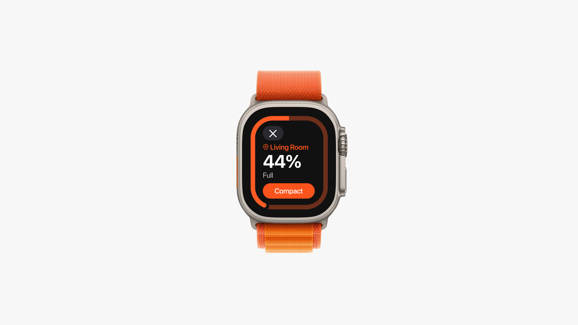
The ClearBin platform was strategically designed for both wearable and mobile technology, acknowledging the hands-on nature of waste disposal. A multi-platform approach was chosen to maximize accessibility, allowing users to engage with the system on devices they already own. While the concept extends to an on-bin interface, launching on existing platforms was identified as the most effective strategy for initial user adoption.
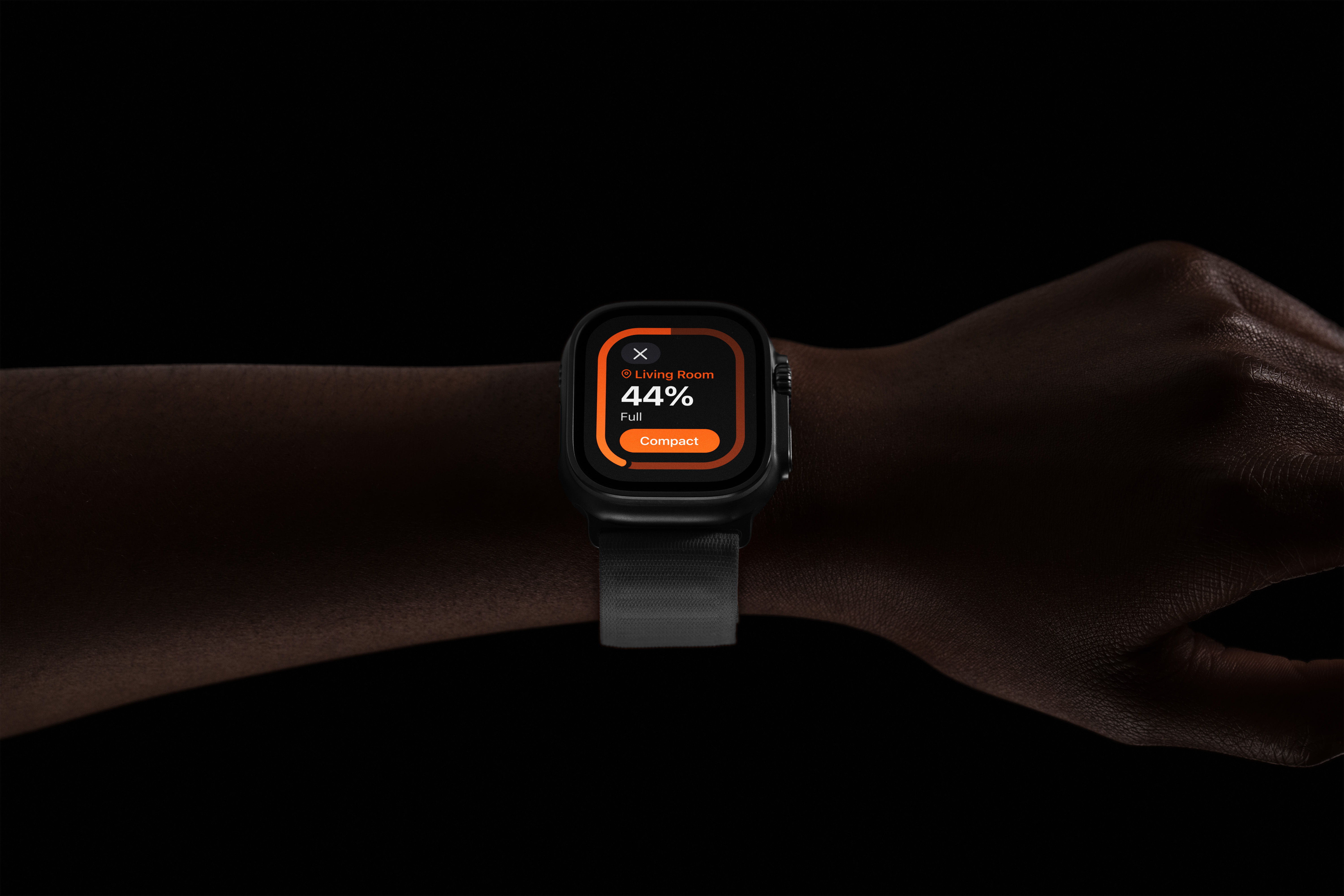
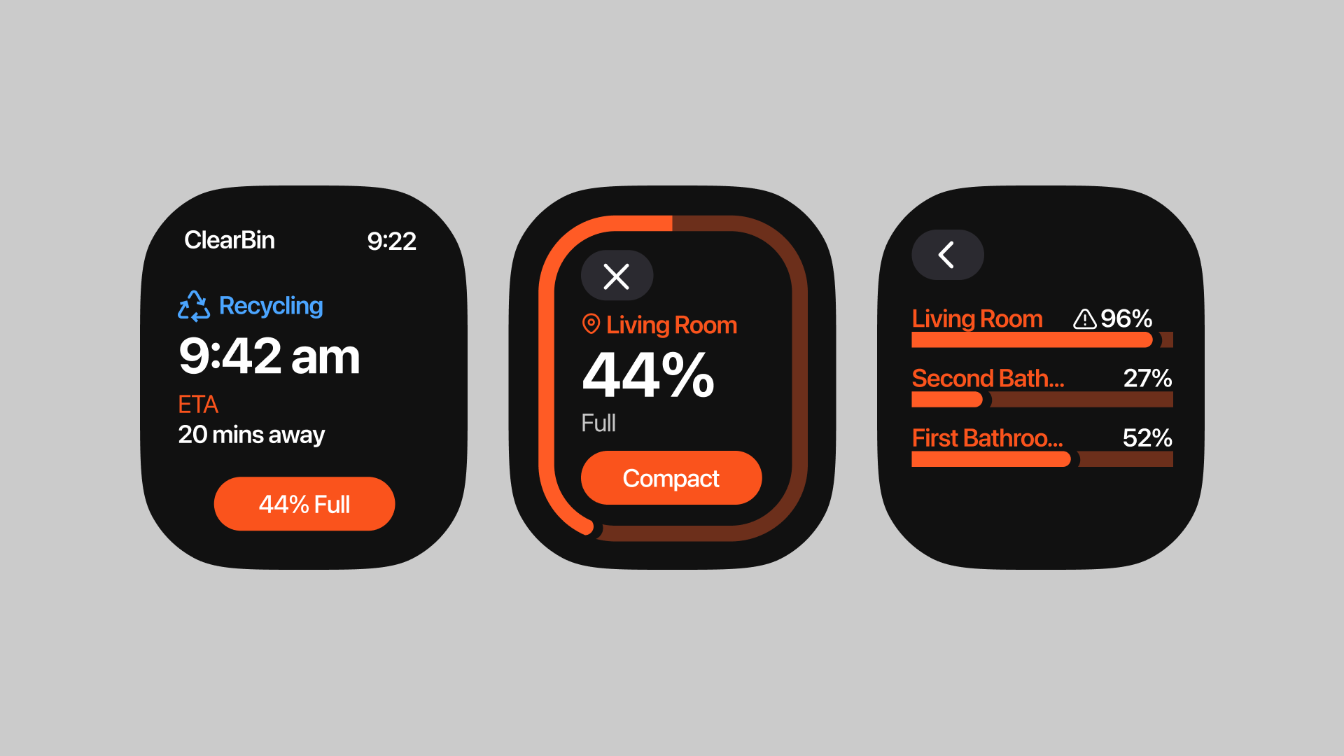
Integrating wearable technology, such as smartwatches, was a key decision to enable a truly hands-free experience. This allows users to perform quick actions like checking bin fullness or remotely compacting trash without the friction of unlocking a phone and navigating to an app. While the wearable interface offers immediate, high-priority functions, the mobile app provides deeper engagement. It serves as a comprehensive educational hub where users can research material disposal guidelines and develop a more nuanced understanding of recycling.

Architecture (IA)
The information architecture (IA) was built on a foundation of real user touchpoints and needs. To deeply understand these pain points, I leveraged AI to generate a series of detailed user scenarios. This process focused on identifying common points of friction during waste disposal, such as carrying heavy or bulky items over long distances, or navigating a driveway.
My process was rooted in the goal of creating a platform that empowers users to grow with their waste management habits. The IA is centered around the idea of enabling and helping the user develop better habits over time. Key features, such as scheduling trash pickup, were streamlined to be accessible in a single tap.
Wireframes
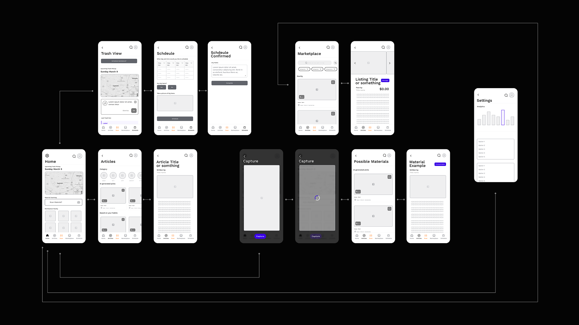
The wireframe phase translated the information architecture into a tangible visual and organizational structure. I adopted a "need-to-know" philosophy, prioritizing the most critical user actions. Core functions like item scanning are featured prominently on the home screen, minimizing the number of taps required to complete a task.
Similarly, features like scheduling and requesting assistance are structured to be short and simple. The goal was to keep interactions light and uncomplicated, ensuring users can achieve their goals stress-free.
The Platform
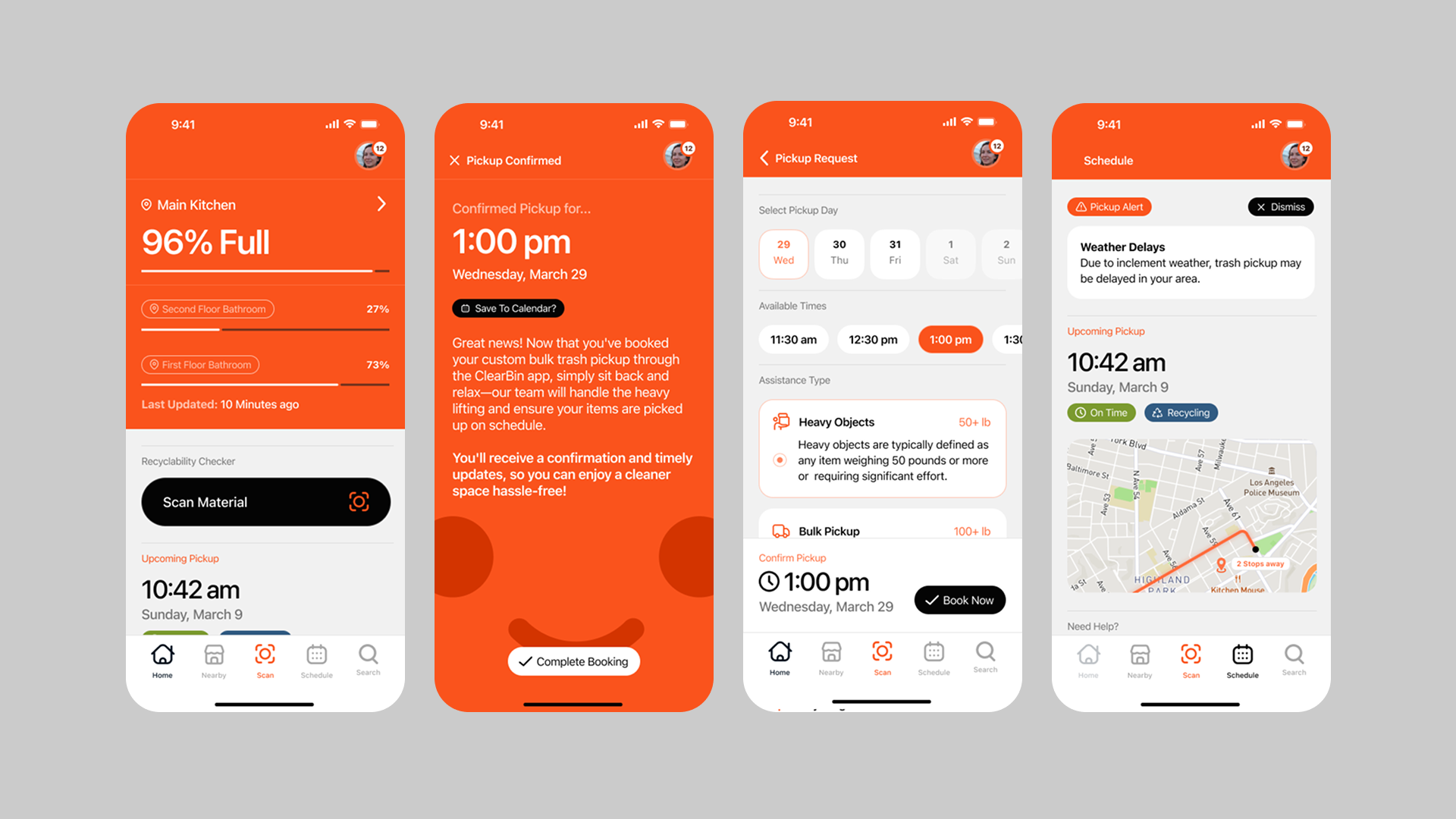
The platform's core objective is to deliver critical, actionable information to users at every stage, from item disposal to collection day. It accomplishes this by providing real-time feedback and guidance on proper sorting, offering proactive reminders for upcoming pickups, and giving users a clear view of their bin's status.
The wearable technology component acts as a direct and immediate extension of the mobile app, providing at-a-glance insights into bin fullness, next pickup schedules, and other key alerts. This immediate feedback loop not only simplifies disposal but also actively reinforces positive recycling habits.
Identity Design
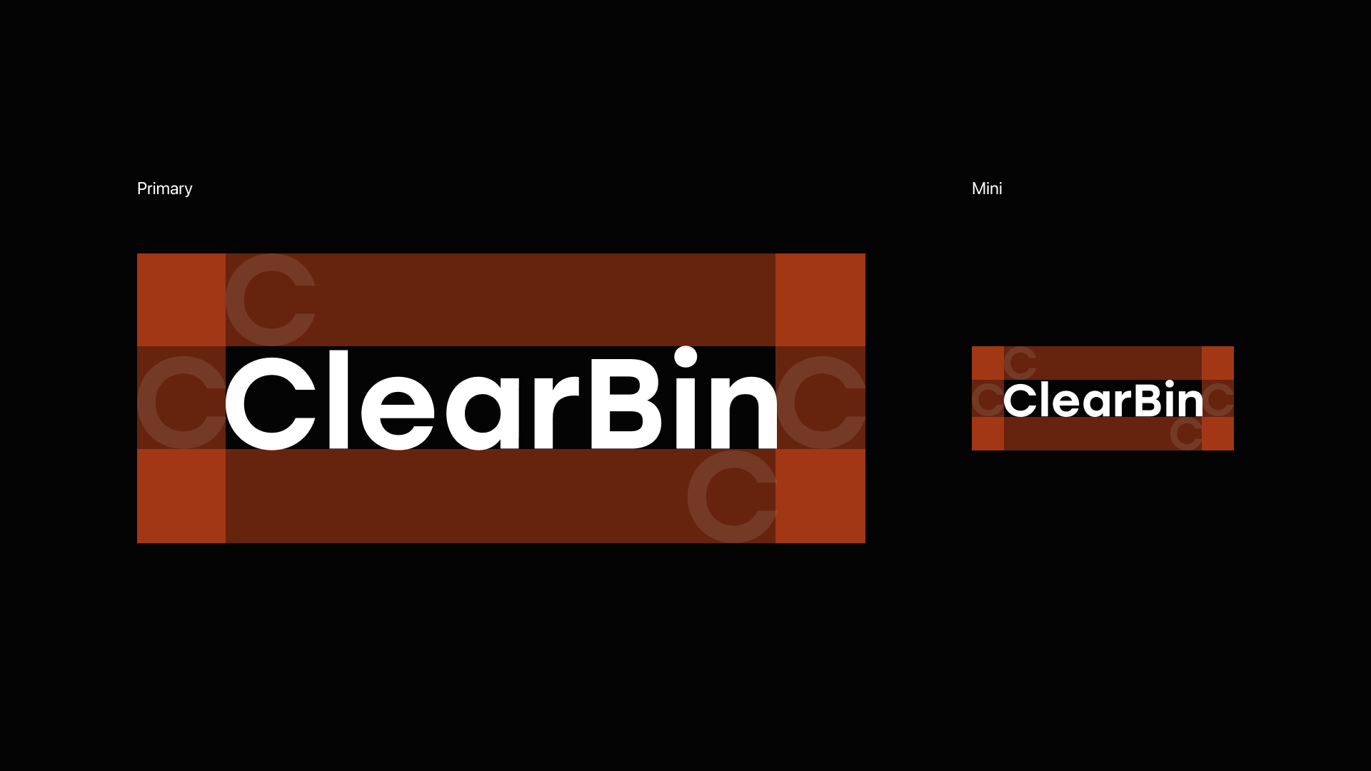
The ClearBin identity uses a high-visibility orange, paired with white and black, to stand out in a landscape dominated by greens and blues typical of recycling and waste solutions. Choosing a bold, contrasting color helps the brand remain memorable and easily recognizable, signaling a fresh approach to waste management.
Additionally, the palette was selected with accessibility in mind—ensuring strong contrast for readability and usability, particularly for older users or those with visual impairments, while maintaining a clean and approachable aesthetic.

Acknowledgements:
Mentorship: Boyl, Brian L.
Disclaimer:
This project is a student work created for educational purposes only. I do not hold or own any rights to the photos used in this project. All images belong to their respective copyright owners.